
Infographic
tell a story and present data so that everyone gets it


Themen & Inhalt
- Understanding Infographics
- The Power of Simplicity
- Versatility and Applications
- The Art of Simplification
- 5 Steps to an Eye-Catching Infographic
- 1. Get the Content Right
- 2. Tell a Story
- 3. Set the Format
- 4. Organize & Try
- 5. Create the Final Artwork
- Story Telling
- Crafting a Memorable Key Message
- The Allure of a Captivating Headline
- Embrace the Power of Focus
- Guiding the Viewer with Structure
- Unveiling the Story's Thrilling Structure
- Embracing Simplicity for Impact
- Cite Right
- Used Sources & Copyright
- License to Use Your Infographic
- Format
- Different Screen Aspect Ration & Social Media Formats
- One Fits Most
- Download Grid
- Fonts
- Colors
- Icons, Cliparts & Graphic Elements
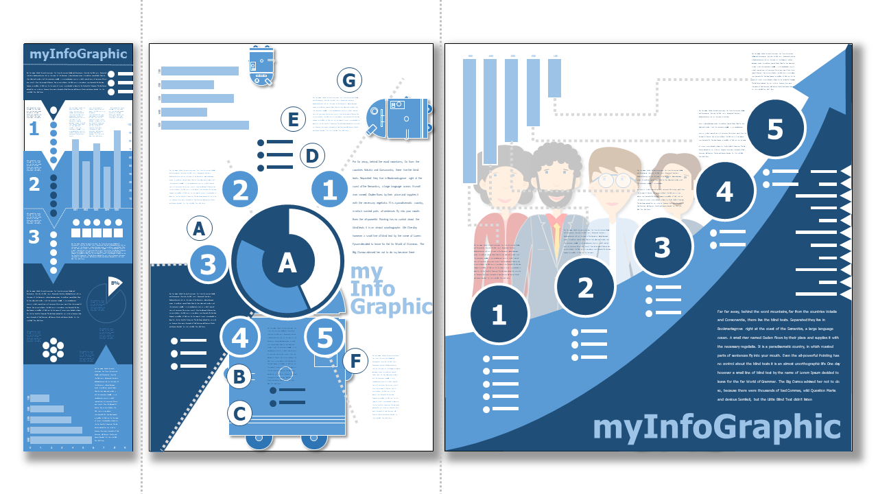
Understanding Infographics ^
# Infographics are visual representations that make complex information easy to understand.

# Infographics are a powerful and versatile way to communicate information effectively.

# They use graphics instead of a lot of text.

# The challenge is to simplify complex content without losing important information.
Infographics are powerful visual representations that present information, data, and processes in a visually appealing manner. Unlike traditional text-based content, infographics focus on graphic elements to convey the message effectively. The primary goal of infographics is to instruct and create an "Ah-ha" experience for viewers, enabling them to quickly grasp and comprehend the content.
The Power of Simplicity ^
One of the distinguishing features of infographics is their simplicity. They contain minimal text and rely heavily on graphic elements to symbolize complex information without the need for lengthy explanations. By doing so, infographics replace text with intuitive visual cues, enhancing the overall understanding of the subject matter.
Versatility and Applications ^
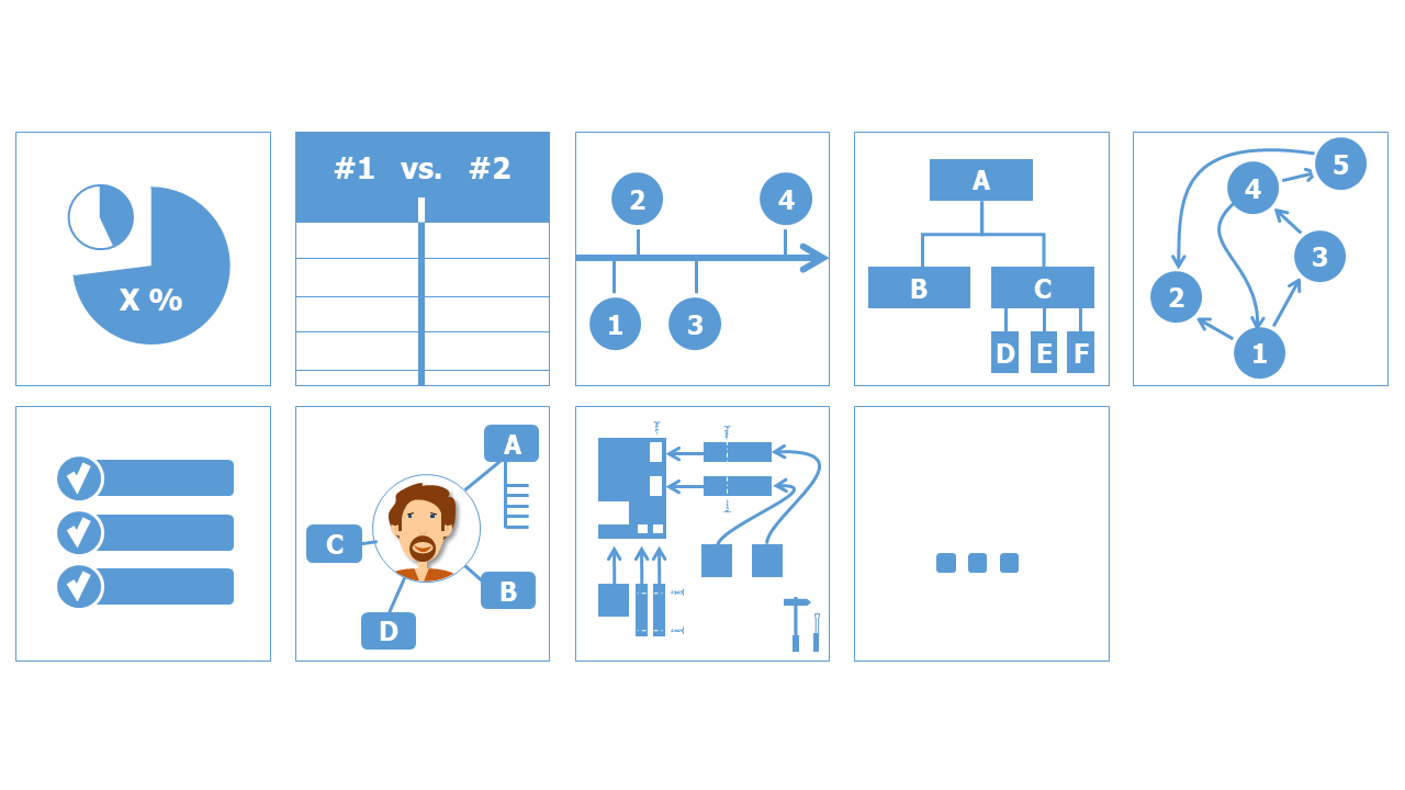
Infographics find applications in various domains and formats, making them incredibly versatile. Some common uses of infographics include:
-
Statistical Results: Presenting data in the form of charts, graphs, and diagrams to showcase patterns and trends effectively.
-
Comparisons: Comparing products, statements, or information side by side, making it easier for viewers to discern differences and similarities.
-
Timelines: Displaying a chronological sequence of events or milestones, giving a clear perspective on historical developments.
-
Hierarchical Representations: Visualizing organizational structures, relationships, and hierarchies using organizgrams.
-
Process Flow: Explaining step-by-step procedures and workflows, simplifying complex processes.
-
Checklists: Presenting information in a concise, checklist format, useful for conveying guidelines and instructions.
-
Personal Information: Creating visual resumes or curriculum vitae that make a candidate's qualifications and experience stand out.
-
Construction Plans: Illustrating construction plans, such as furniture designs, in an easy-to-understand visual format.
The Art of Simplification ^
The biggest challenge in creating infographics is to understand the complex context, identify logical relationships and simplify the result.
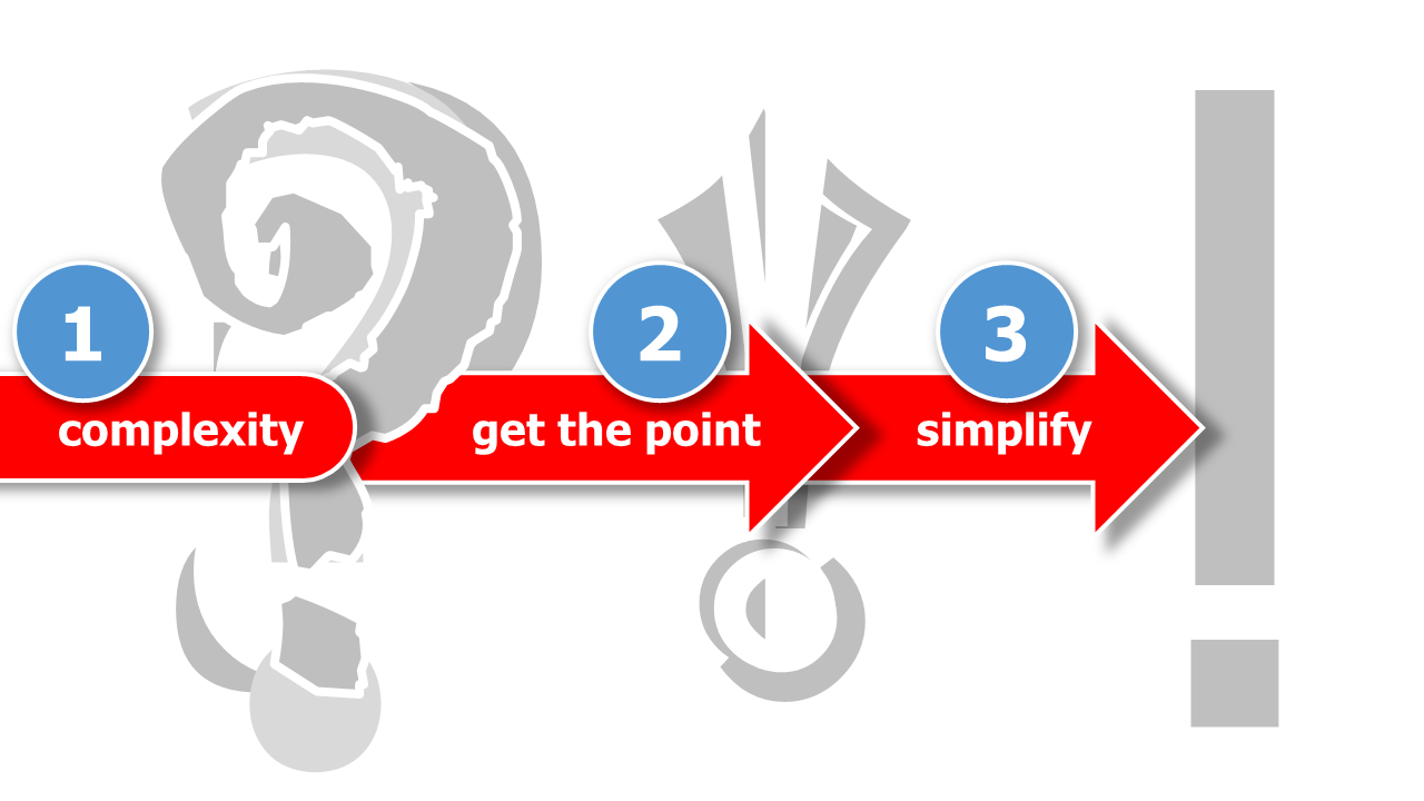
Creating infographics involves tackling complex issues and presenting them in a simplified manner. However, this process poses several challenges:
-
Generalization of Data: Due to space constraints, infographics cannot showcase all specific details. Instead, they rely on generalized data to convey the main message effectively.
-
Simplification: Infographics must simplify content without compromising its essence to ensure quick and vivid comprehension.
-
Using Graphic Elements: Icons, graphics, arrows, text boxes, and colored elements are essential tools in the infographic creator's arsenal. These elements work together to create engaging visuals.
5 Steps to an Eye-Catching Infographic ^
# Get the content right.

# Understand the audience's needs.

# Organize information logically & engagingly and design with care.
To create an eye-catching infographic that effectively communicates your message to your target audience you can follow these five steps:
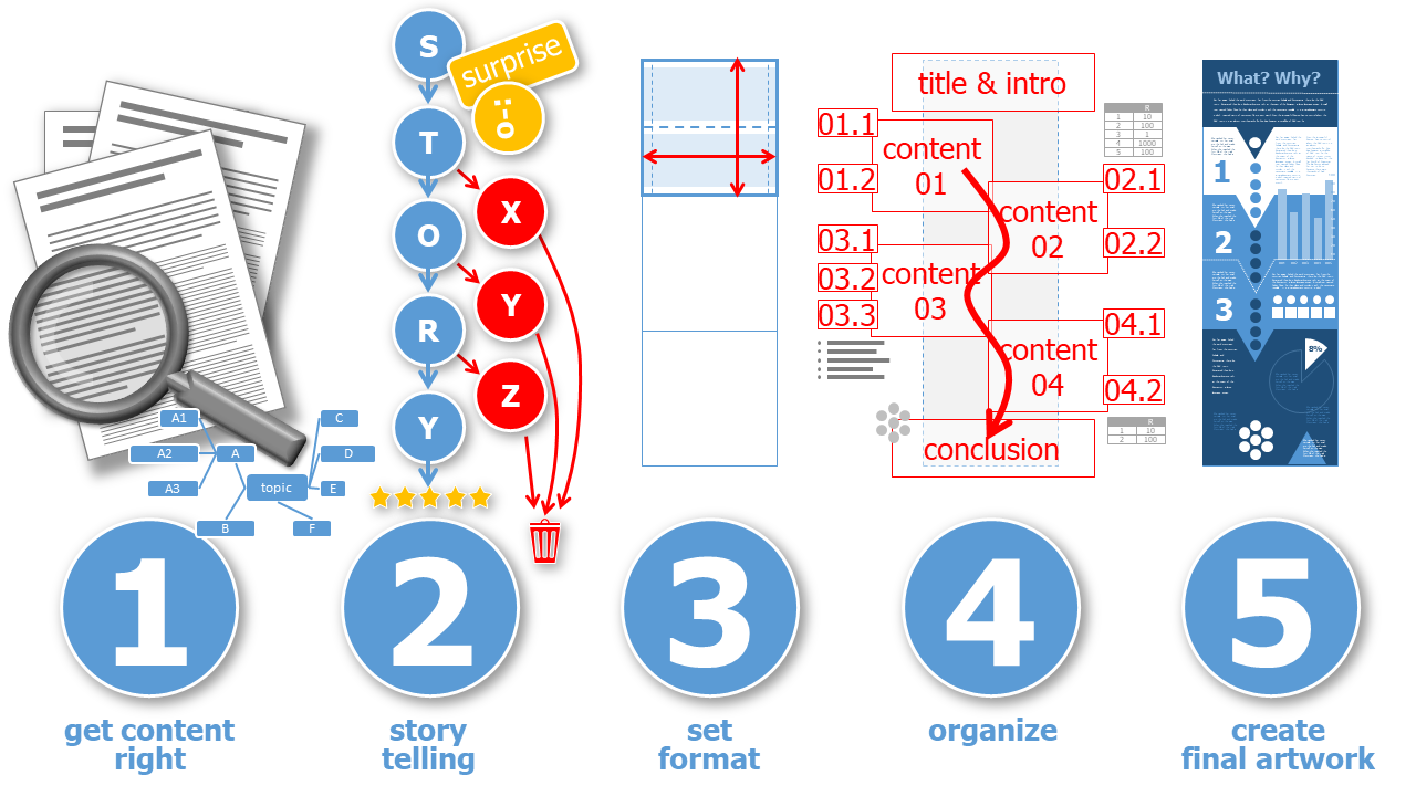
1. Get the Content Right ^
The foundation of a compelling infographic lies in the content. Start by conducting thorough and detailed research on the topic you want to present. Gather relevant data, facts, and statistics that support your message. Once you have your research, consider the following:
-
Create a Mind Map or Sketch: Visualize the relationships and hierarchies of the content. Simplify and focus on the most important information.
-
Set up Essential Contents and Steps: Organize your information into clear steps or milestones, ensuring a logical flow throughout the infographic.
-
Focus on One Aspect: Keep your infographic centered around one main idea or statement to avoid overwhelming your audience.
2. Tell a Story ^
To make your infographic truly impactful, you must tell a compelling story with your data. Consider your audience's needs and pain points and use the Avatar Persona methodology to understand them better. This will enable you to design an infographic that resonates with your target audience.
-
Create a Narrative: Arrange your content in a sequence that flows logically from start to finish. Highlight the most critical information and provide an outlook for your audience.
-
Lead the Viewer: Guide your viewers through your infographic using well-organized elements, data, and information. Ensure they can easily follow the story you're telling.
-
Avoid Overloading with Details: Simplify your content by excluding non-essential details. Less is often more in infographics.
Find more details below on how to tell a good story and make your infographic an attractive source of knowledge for your audience.
3. Set the Format ^
Selecting the right format is crucial to ensure your infographic looks visually appealing and fits various platforms. Consider these tips:
-
Aspect Ratio: choose the correct format, which is common for the purpose. Depending on the (social media) platform, this is slightly different. For example use a square format (1:1) or a multiple like 2:1, 3:1, etc. You can also use vertical formats if applicable or horizontal formats for swipeable content on social media.
-
Cutting the Format: Divide the chosen format into sections where individual pieces of information will be placed. This way, your infographic will still be understandable if it's resized or used on different platforms.
4. Organize & Try ^
Organizing your infographic's content and layout is essential for clarity and aesthetics.
Draw rough sketches of your infographic layout to explore different arrangements. Choose the one that best suits your narrative.
5. Create the Final Artwork ^
Now that you have a solid plan, it's time to bring your infographic to life. Pay attention to the following design elements:
-
Fonts and Font Sizes: Use clear and legible fonts. Adjust font sizes to ensure readability across different devices.
-
Graphics and Icons: Choose graphics and icons that complement each other in style and consistency.
-
Spacing and Alignment: Keep a consistent spacing to the edges of your infographic and maintain adequate space between elements to avoid clutter.
-
Color Selection: Choose colors that harmonize with your brand or message and use them consistently throughout the design.
By following these five steps, you'll be well on your way to creating an eye-catching and effective infographic. Remember, practice makes perfect, so don't be afraid to experiment and refine your design skills.
Story Telling ^
# Use pictures and charts to tell a cool story in your infographic.

# Share one important thing you want people to remember.

# Make your infographic easy to follow with a clear start, exciting middle, and satisfying end.

# Keep it simple and fun!
Telling a good story is the essence of a good infographic. However, instead of describing and decorating the story with a lot of text, the infographic is based on quickly understandable icons, charts and graphical structures.
Crafting a Memorable Key Message ^
At the core of every exceptional infographic lies a single, powerful key message. Before you start designing, ask yourself: What is the most crucial piece of information you want your audience to remember? Avoid cluttering your infographic with multiple messages, as it can dilute the impact. Be critical and discerning, focusing all your energy on identifying that one message that will resonate with your viewers. Put yourself in their shoes, envision their curiosity, and design your infographic around that pivotal key message.
The Allure of a Captivating Headline ^
A well-crafted headline acts as a gateway to your infographic's world. Aim to entice your audience with a clear, intriguing, and easily digestible headline. Make them curious by presenting a personal context, an exciting question, or a surprising statement. When your headline piques their interest, they'll be compelled to explore your infographic further, seeking answers and revelations.
Embrace the Power of Focus ^
Remember, your infographic should not attempt to explain the entire universe of a topic. Instead, it should zoom in on a specific aspect, addressing a particular question or concept. By staying focused, you can deliver a more impactful and coherent message to your audience.
Guiding the Viewer with Structure ^
Infographics, like any well-told story, need guidance and a clear sense of direction. You can achieve this through structured graphic elements and a thoughtful hierarchy of fonts and graphics. Less can often be more in design, enabling viewers to grasp the overall structure at a glance and navigate seamlessly through your infographic.
An effective infographic demands a compelling introduction. Hook your audience by explaining the topic's importance and relevance to them. Guide them smoothly from one point to the next, unveiling crucial connections, sequences, and results. And don't be afraid to conclude with a powerful call to action, motivating your viewers to take the next steps.
Unveiling the Story's Thrilling Structure ^
Great infographics often follow a structured scheme to generate interest and excitement. Think of it as a three-act play:
-
The Setup: Begin with an introductory conflict, setting the stage for your audience's exploration. Engage them with a relatable starting point.
-
The Climax: Build up the action, gradually escalating the intensity of your message. This is the heart of your infographic, where your key message shines brightest.
-
The Resolution: As the climax subsides, lead your audience towards a satisfying resolution and explanation. Provide a "happy ending" by fulfilling the promises made in your headline.
Embracing Simplicity for Impact ^
Always remember, clear structures and essential content define exceptional infographics. Avoid overloading your design with unnecessary elements. Instead, focus on providing a quick and informative overview, helping your audience find answers and insights effortlessly.
As you embark on your infographic storytelling journey, embrace creativity, practice empathy, and fine-tune your ability to distill complex information into a visually stunning narrative. Let your infographics speak volumes, capturing hearts and minds with the power of storytelling through graphics.
Cite Right ^
# Properly cite sources.

# Use licenses like Creative Commons (CC-BY, CC-BY-SA) to specify usage terms for your work.

# Only use graphical elements that meet the licensing requirements of your chosen license.
Used Sources & Copyright ^
When incorporating content from external sources into your infographic, whether it's text, images, graphical elements or other media, you must ensure you are complying with copyright regulations. This includes providing proper attribution to the original authors and publishers.
For content used in your infographic, when quoting or paraphrasing, you should clearly indicate the source by including the following information:
- name(s) of the author(s)
- title of the work
- year of publication
- journal or anthology information (if applicable)
- page range (if applicable)
For graphical elements or visual content used in your infographic, the same principles apply. You must ensure that the source information is readily available on the image itself. If you only see short references like the author and year, that's insufficient, and using such images, graphical elements or other third party sources without proper attribution can lead to legal consequences.
Use Endnotes
An effective method for accurately citing sources in their appropriate locations is through the use of endnotes. Each individual citation is assigned a consecutive number enclosed within square brackets. These numbers can be presented in either the same font size as the main text or as superscripts. The comprehensive source details are subsequently provided in a somewhat subordinate position, utilizing a slightly smaller font size, within the Graphical Abstract. It's important to note that a distinct page dedicated solely to listing sources, apart from the Graphical Abstract, is not permitted.
License to Use Your Infographic ^
As the creator of an infographic, it is essential to consider how you want others to use your work. Utilizing a license will clarify the terms under which your infographic can be further used by others.
I strongly advise you to use an Open Educational Resources (OER) license, which includes Creative Commons licenses such as CC-BY (Attribution) and CC-BY-SA (Attribution-ShareAlike). These licenses allow others to use, share, and build upon your infographic, as long as they give appropriate credit to you as the creator.
When using these licenses, make sure to include the following information on your infographic:
- your name (or alias) as the creator
- the date of publication
When creating your infographic, it's crucial to use graphical elements that meet the licensing requirements of the license you choose. This means using elements that are either in the public domain, under Creative Commons licenses compatible with your chosen license, or that you have obtained permission to use from the copyright holders.
| license to use your infographic | license of all used graphical elements |
|---|---|
| CC-BY |
|
| CC-BY-SA |
|
| CC-BY-NC-SA |
|
By following these guidelines, you not only adhere to copyright laws but also contribute to the free exchange of knowledge and support the open education movement.
Remember, accurate citations and proper licensing not only demonstrate integrity as a creator but also promote responsible and ethical infographic design.
Format ^
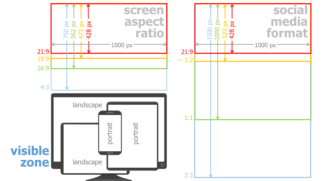
The format chosen for an infographic depends on its widespread distribution. Will the graphic be printed as a poster or must it be easily recognizable on all screens. Infographics are eye-catchers in social media and increase the click rate. But to do this, the infographics must be adapted to the requirements of the individual social media providers (which are usually different). A uniform layout that can be used everywhere is thus difficult to create.
Different Screen Aspect Ration & Social Media Formats ^
Monitors and smartphone screens currently have a format of mostly 19:6. A part or multiple of a square can be used well in many areas of social media image ads. It may be necessary to leave border areas without important information so that nothing important is lost when the infographic is automatically cropped.
One Fits Most ^
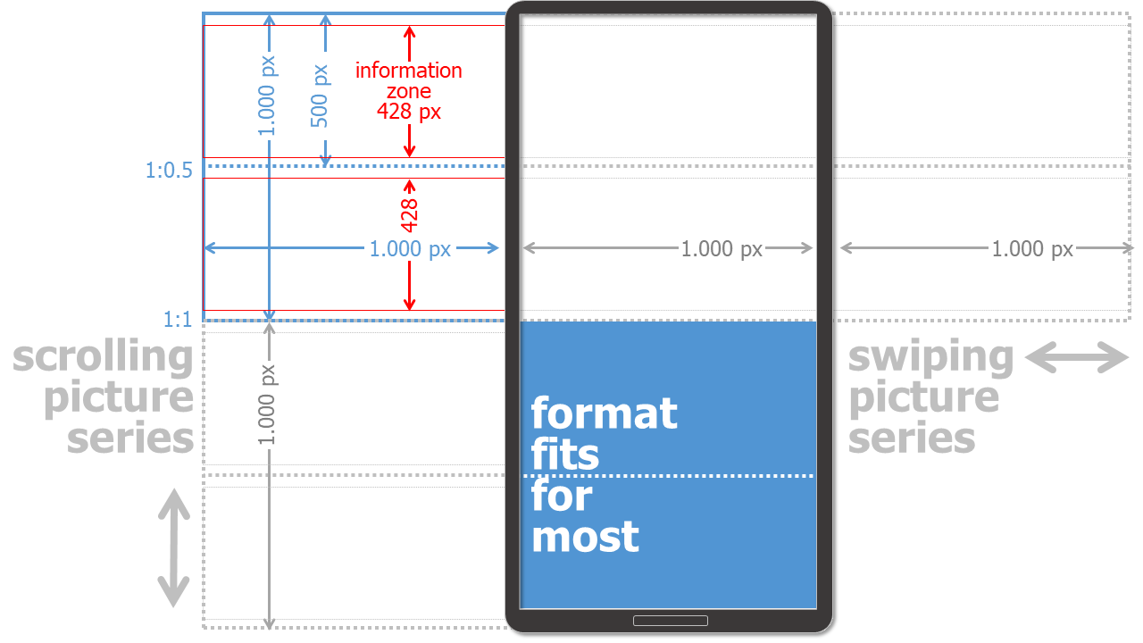
Despite the variety of screen sizes and frameworks for images in social media, here is a format that meets many conditions:
Square as Basic Grid & Half Square as Content Unit
The basic layout is a square grid in this design example. This is halved horizontally and divided into 2 individual areas. If the display allows only half a square, a coherent content must be displayed here. This also applies to the extension of 1.5 or 2 squares.
21:9 as Text & Graphic Area
In addition, the focus is placed on a 21:9 field, which contains the most important information (information zone). This system can now be extended horizontally or vertically additively. It depends on whether, for example, individual images can be better served by wiping (to the left and right) or by scrolling (down and up). Wiping is mostly only possible in social media. However, an infographic as a pdf document, for example, is difficult to operate left-right and therefore to view.
1.000 Pixels as a Unit of Measurement
Not necessarily 1.000 x 1.000 pixels (px) is the best and correct dimension for any design. Depending on the screen resolution, other pixel dimensions may be more suitable. From my experience, however, images with a size of 1.000 px are well suited and do not take up too much space to save and download.
Testing, Testing, Testing
However, it is always important to test on potential devices (smartphone, screen, printer, ...) in order to be able to judge the result correctly there.
It makes sense to perform the layout check on an user device not only with the finished end result, but already during the format selection and creative layout process.
Download Grid ^

Import the grid file into your presentation software or vector program. Move the grid to the background and place text and images over it. When everything is layouted, delete the grid ;-)
Fonts ^
When it comes to fonts, you need to limit yourself. A smart layout and design will not use more than 2 fonts. If you insert graphics, make sure that the fonts of the graphics are the same as the rest of your text.
The same goes for font sizes. Here the rule is: no more than 3 different sizes. Make sure that they are different from each other. If you insert and scale graphics and diagrams with text, the font size will change too. The best thing is to make all text elements uniform: add them afterwards.
Colors ^
A consistent color scheme is what makes an infographic look professional. There are endless examples and ideas for color schemes and canvas templates on the internet.
Icons, Cliparts & Graphic Elements ^
Use uniform graphic elements and draw them yourself! Use consistent color scheme and same look. Please do not mix 2D and 3D or colored and black-and-white elements in one infographic. You can draw icons and graphic elements by hand or create them using geometric elements. However, opt for a uniform way. Use a similar level of detail in your infographic. This way your characters either have a face or none. And again: please do not mix different styles!
It is very easy to create icons and other graphic elements yourself, e.g. in presentation software or a vector drawing program. By merging or extracting basic shapes such as circles and rectangles or freehand elements, you can easily create complex shapes and elements.
Make sure that you are allowed to use all graphic elements you import into your infographic. Simply copying something from the Internet usually violates copyrights. Using a graphic element that contains a watermark (usually as a thumbshot) is also not allowed.
 Creative Commons 4.0 International Licence [CC BY 4.0]
|
Infographic - Christian Huber
|
12.09.2024
|
Impressum
|
Datenschutz
Die Texte auf dieser Seite wurde mit Hilfe von Generative Pre-Trained Transformers / Large Language Models lektoriert.
![Creative Commons 4.0 International Licence [CC BY 4.0]](https://melearning.online/WissenschaftlichesArbeiten/themes/simpletwo/images/meLearning/cc-by-large.png)