Graphical Abstract
show your results at a quick view


Themen & Inhalt
- Visual Presentation of Research Findings
- Science for non-scientists
- Start with the WHY
- Use everyday language
- Design as you like
- Show briefly the most important content of a scientific paper.
- Illustrate & Visualize
- Graphical Elements
- Harmonized Colors & Elements
- Cite Right
- Used Sources & Copyright
- License to Use Your Graphical Abstract
- Using Templates
Visual Presentation of Research Findings ^
Graphical abstracts are summaries designed with illustrative graphical elements that support the content, usually in the size of a landscape image.
When communicating knowledge, usually only a short moment is important to draw the attention of interested people to the content. Visibility is an important aspect in this process. This insight is also used by science in communication. Short summaries are therefore used as teasers and introductions to (research) findings. The aim is to give a quick overview of the approach, the most important findings and the conclusions.
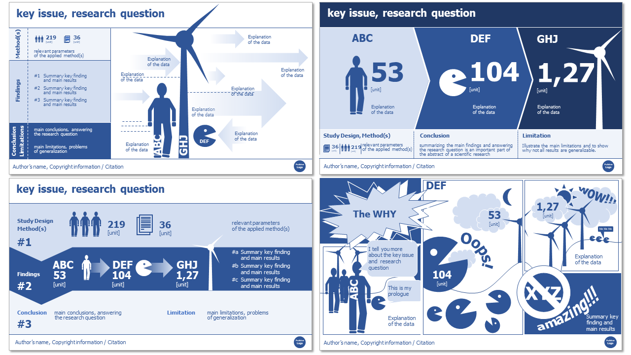
Graphical abstracts can look like this:

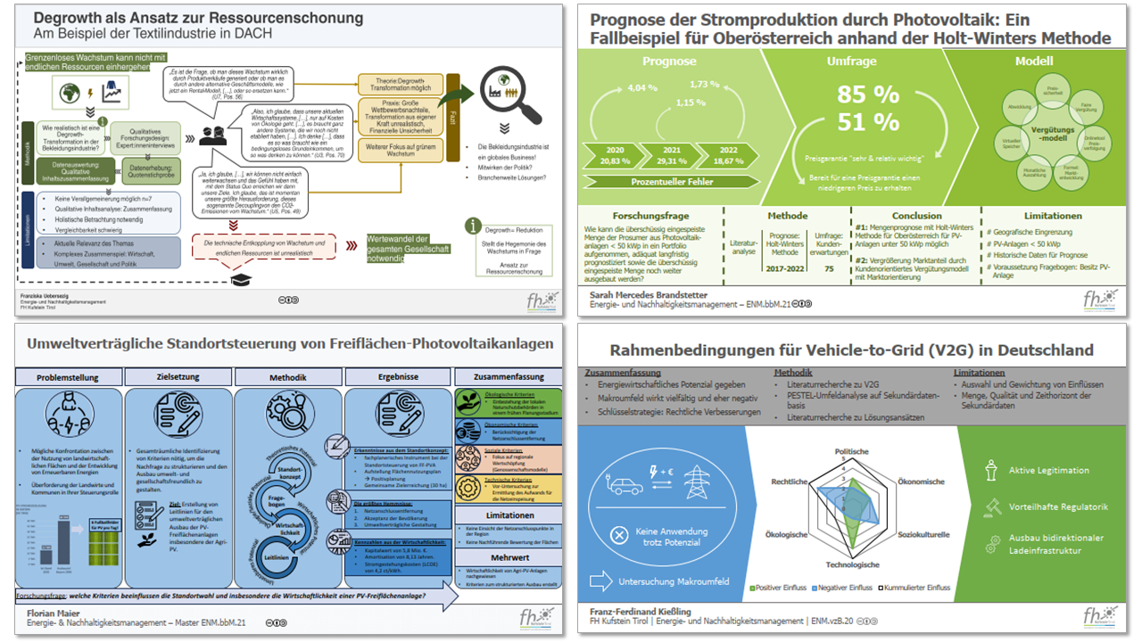
Here are a few different examples from students:

Science for non-scientists ^
Usually scientific results are read only by the expert community. I think not even experts actually read everything. At the same time it is true in science that many clicks on an article and especially corresponding citations bring great reputation. Science should - as many funding bodies want it - also inform a broader population about the (research) results. This is partly so that funders can show what is being funded and why. So, for example, to justify the tax money used but also for innovation marketing by the companies involved in the research. So success of science is (also) related on scope.
However, scope is limited by pay walls, but also by a lot of text and technical vocabulary. Therefore, the following aspects should be considered and taken into account in science communication:
Start with the WHY ^
For the expert community, the meaning behind a (research) question is often clear in a logical way. For non-scientists, the context must first be presented to understand the relevance of the work. It is about understanding WHY the (research) results are important and relevant. Use as general as possible and quickly understandable connections that have something to do with the lives and experiences of the people addressed. Do not make the mistake to describe the context from a scientific perspective in a way that is too complicated and only understandable for experts.
Use everyday language ^
Scientists often communicate using complicated jargon that needs to be explained to non-scientists. In addition, a corresponding level of specialist knowledge is often assumed in order to understand the problem, methods and results. For science communication outside the scientific community, this knowledge cannot be assumed and therefore this language is not useful. Write in understandable & descriptive words with short, simply structured sentences. Think carefully about which specialized terms are absolutely necessary. and explain them.
Design as you like ^
Well... maybe this statement is a bit too far, because it is about communicating scientific results and a certain objectivity is necessary... and of course criminal, sexist and racist representations are taboo!
However, the range of designs of graphical summaries is very wide. I have listed here 3 different typologies:
-
The structured process managers: Process steps, sequential actions and dependencies are the stylistic device of this type of graphical abstracts. Here you can find flowcharts, check lists and relationship diagrams.
-
The statistics enthusiasts: Numerical data, statistical data and more numbers & digits are graphically visualized here. However, this does not mean that circular, bar, net or other diagrams are shown on this page. No. Numbers are combined with icons and graphic elements and then visualized in a typographical style.
-
The infomer: Info and explanation graphics are the dominant styles of this format.
-
The scientific comic freak: Yes, exactly... Comics are also part of the graphic abstract repertoire. Jokes and hints are stylistic elements that visualize science in a less serious and conventional way. If you like that, you can let yourself go crazy in this field. Often these scientific comics are drawn by hand.
what sort of character are you? What do you like? What communicates the content best?
Show briefly the most important content of a scientific paper. ^
To show the most important information from a scientific work, the following contents are usually presented in a graphical abstract:
-
central question, main topic, most important statement: maximum one sentence that stimulates interest.
-
method, research design: description of the research method used and most important parameters to assess the scientific quality (e.g. sample size, response rate, important parameters of a simulation, number of interviewed persons, number of analyzed texts
-
most important findings / results: not all, but selected ones (the special ones.., the most important ones..)
-
conclusion and in some cases also limitations
Illustrate & Visualize ^
Visualization with eye-catching graphic elements are the key features of a graphic abstract. Text is not in the focus and is more explaining and commenting on the graphical elements.
Graphical Elements ^
The following elements can be found in graphical abstracts:
- icons
- typographic markups (highlighted, large font, bold, ...)
- overviews or process illustrations that are easy to recognize
Respect the right of use
Graphic elements are copyrighted elements. This also applies in the context of teaching, research and student work. Make sure you have the appropriate rights to use and modify them. Creative Commons offers the possibility to get uniform information about the corresponding usage rights in an international context. A good option is to design graphic elements yourself or to use Open Educational Ressources - OER.
Harmonized Colors & Elements ^
Colors and graphic elements are matching. Color palettes can be used for this that support the objective and scientific content well. Make sure they are visible even to people with color vision deficiencies! The Web Content Accessibility Guidelines specify appropriate contrast ratios for this. There are Color Contrast Analyzer tools to find out whether selected color combinations (foreground & background) meet the requirements.
Monochrome Color Scheme
One color is used in several shades (mixing one color with white or black).
Consistent Graphical Elements
Graphics and icons should also be chosen so that there is a consistent design (degree of abstraction, shape, line thickness, ...).
Cite Right ^
# Properly cite sources.

# Use licenses like Creative Commons (CC-BY, CC-BY-SA) to specify usage terms for your work.

# Only use graphical elements that meet the licensing requirements of your chosen license.
Used Sources & Copyright ^
When incorporating content from external sources into your graphical abstract, whether it's text, images, graphical elements or other media, you must ensure you are complying with copyright regulations. This includes providing proper attribution to the original authors and publishers.
For content used in your graphical abstract, when quoting or paraphrasing, you should clearly indicate the source by including the following information:
- name(s) of the author(s)
- title of the work
- year of publication
- journal or anthology information (if applicable)
- page range (if applicable)
For graphical elements or visual content used in your graphical abstract, the same principles apply. You must ensure that the source information is readily available on or nearby the image itself. If you only see short references like the author and year, that's insufficient, and using such images, graphical elements or other third party sources without proper attribution can lead to legal consequences.
Use Endnotes
An effective method for accurately citing sources in their appropriate locations is through the use of endnotes. Each individual citation is assigned a consecutive number enclosed within square brackets. These numbers can be presented in either the same font size as the main text or as superscripts. The comprehensive source details are subsequently provided in a somewhat subordinate position, utilizing a slightly smaller font size, within the Graphical Abstract. It's important to note that a distinct page dedicated solely to listing sources, apart from the Graphical Abstract, is not permitted.
License to Use Your Graphical Abstract ^
As the creator of an graphical abstract, it is essential to consider how you want others to use your work. Utilizing a license will clarify the terms under which your graphical abstract can be further used by others.
I strongly advise you to use an Open Educational Resources (OER) license, which includes Creative Commons licenses such as CC-BY (Attribution) and CC-BY-SA (Attribution-ShareAlike). These licenses allow others to use, share, and build upon your graphical abstract, as long as they give appropriate credit to you as the creator.
When using these licenses, make sure to include the following information on your graphical abstract:
- your name (or alias) as the creator
- the date of publication
When creating your graphical abstract, it's crucial to use graphical elements that meet the licensing requirements of the license you choose. This means using elements that are either in the public domain, under Creative Commons licenses compatible with your chosen license, or that you have obtained permission to use from the copyright holders.
| license to use your graphical abstract | license of all used graphical elements |
|---|---|
| CC-BY |
|
| CC-BY-SA |
|
| CC-BY-NC-SA |
|
By following these guidelines, you not only adhere to copyright laws but also contribute to the free exchange of knowledge and support the open education movement.
Remember, accurate citations and proper licensing not only demonstrate integrity as a creator but also promote responsible and ethical graphical abstract design.
Using Templates ^
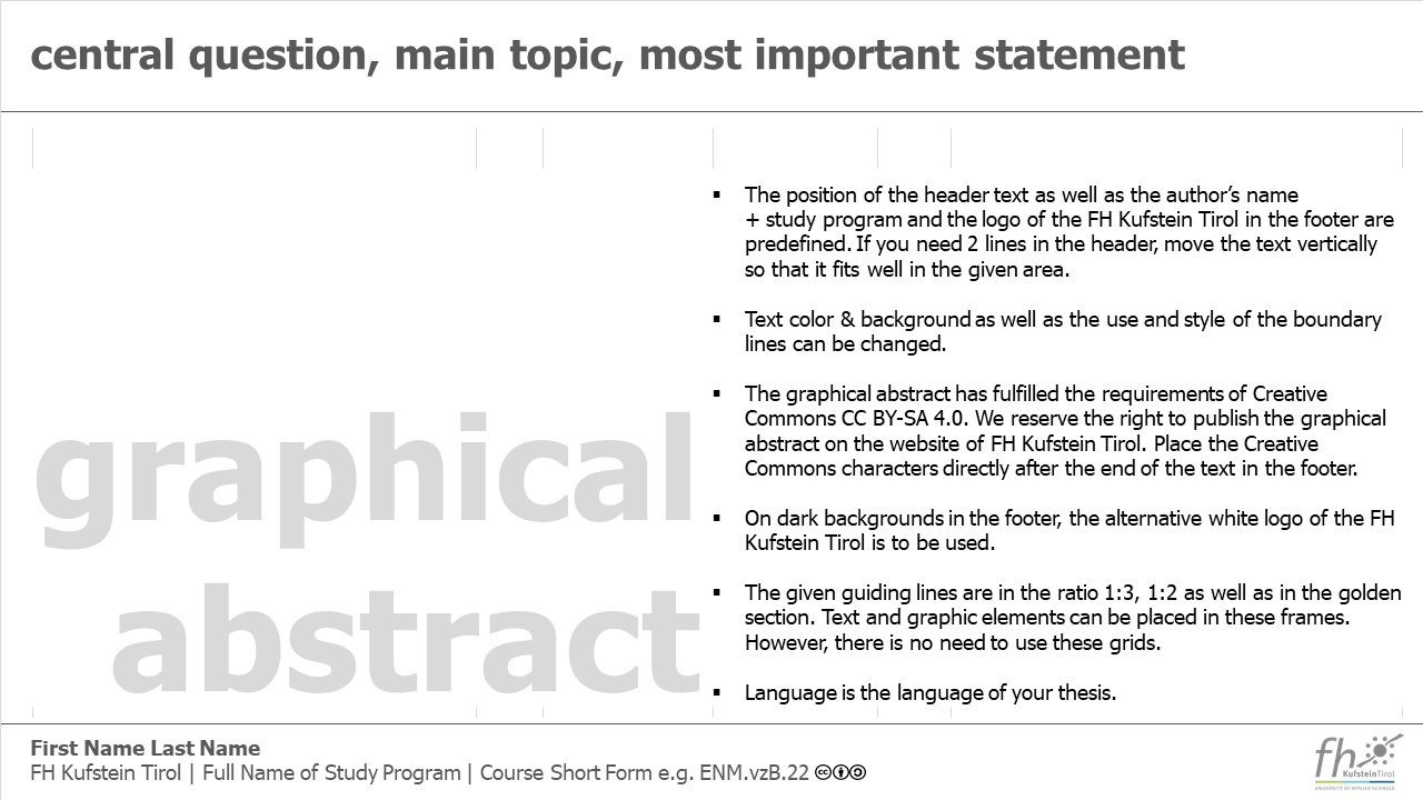
Feel free to use a template, but make sure you adapt it to the specifications and to the needs of your Graphical abstract!
 Creative Commons 4.0 International Licence [CC BY 4.0]
|
Graphical Abstract - Christian Huber
|
12.09.2024
|
Impressum
|
Datenschutz
Die Texte auf dieser Seite wurde mit Hilfe von Generative Pre-Trained Transformers / Large Language Models lektoriert.
![Creative Commons 4.0 International Licence [CC BY 4.0]](https://melearning.online/WissenschaftlichesArbeiten/themes/simpletwo/images/meLearning/cc-by-large.png)
