Presentation
how to impress with your presentation


Topics & Content
- Presentation
- Audience Listening & Watching
- Core Message
- Design elements
- Grid
- Slide Transitions
- Animations
- 3 Steps to a Successful Presentation
- 1. Core Message & Storyboard
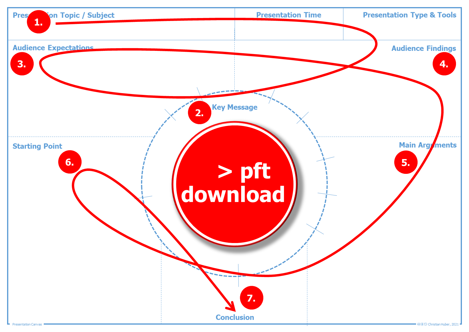
- Presentation Canvas - Template
- Brainstorming - Template
- 2. Spoken Text & Supporting Media
- Storyboard - Template
- Important Tips on the Correct Use of Media
- 3. Practice & Technique Check
- Speech
- Gestures, Facial Expressions, Body Posture
- Technique Check
- Literature & Further Information
Presentation ^
A presentation is about presenting a(!) core message to the audience watching and listening. In the scientific community, for example, presentations serve to introduce the research idea, to inspire partner companies for the idea, to present interim results or to present the research results in conferences. Here it is always a matter of selling and winning over to some extent. The same applies to students. From the presentation of project results to the presentation of one's own thesis. Here, too, it is about selling and impressing.
In this chapter, presentation is basically understood as lecture, the presentation of a central message. The spoken word is supported by media. This can be slides but also blackboard notes and live drawn or prepared flipcharts.
Audience Listening & Watching ^
The presentation must be oriented to the audience. Expectations and prior knowledge of the audience influence the presentation. I even go one step further: only if the audience's expectations are taken into account and the core message is received by the audience, the presentation is successful and good. The audience must therefore always be the focus of all decisions in the creation and presentation.
Core Message ^
When preparing a presentation, the first step is to identify the core message to be presented. This is the central starting point and should be considered first. The following is important here: Less is more! The attention span of listeners and viewers is short, so that one(!) core message is sufficient.
In order to present the core message effectively, arguments are needed. This should be fact-based, not only in a scientific context. Main arguments may have sub-arguments, so that the evidence becomes comprehensible. Again: Less is more! Not all arguments fit into the (time) frame of a presentation / lecture. Therefore, it is important to use only the most important and comprehensible arguments.
Design elements ^
Grid ^
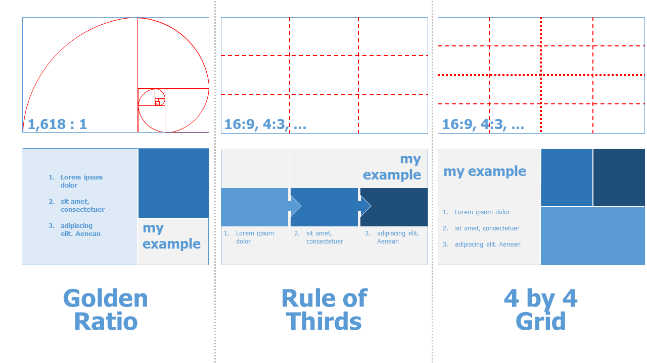
The layout grid visually organizes the slides and increases the recognition effect. In addition, a grid usually creates a more visually attractive design than a presentation without a uniform grid system. Graphic elements such as text or images do not always have to be in the same position. A variety, which is not carried out too chaotically, makes the layout appear more "alive".

Generally, there are several grids:
-
rule of thirds: Here the width and height are divided into 3 x 3 equal parts each. This is a very simple grid, but it offers some design freedom and appears visually appealing.
-
grid with odd divisions (3x3, 5x5, 7x7, 9x9, ...): Due to the odd number of grid boxes, there is no center and no symmetry, but always asymmetrical divisions. This creates a very dynamic appearance.
-
4 by 4: With this grid system, width and height are divided into 4 x 4 parts each.
-
straight pitch grids (4x4, 6x6, 8x8, ...): These grids create a center, but make the layout appear less dynamic.
-
golden rule: This divides the aspect ratio 1:1.61803.... divided. The golden ratio has been found in art for many centuries as an ideal of beauty and "graceful" design. However, a correct use of the golden section also means an adapted foil format of e.g. 16.18cm x 10cm or corresponding multiples thereof.
Download Grid Template
-
This 3x3, 4x4 and 5x5 grid template helps to design your own presentation template.
-
This template helps to design a presentation slide in golden ratio
Slide Transitions ^
While many presentation slides "only" use a snapshot-like slide change, slide transitions can also be used to create complex scenes and presentation worlds. The audience perceives the presented information as an excerpt from a room or a universe if the transitions are used in an appropriate way.

Animations ^
In most common presentation software, individual elements can be animated. This allows you to create cartoon-like movements to clarify the content and to dynamically break up the otherwise static presentation. Again, the use of animations should be well-considered and rather not from the free repertoire of animations not created by yourself.
Here is an example from one of my presentations:

3 Steps to a Successful Presentation ^
In three steps I show how to plan and implement a successful presentation. Never start a presentation by opening a presentation software! Presentations need a lot of time in preparation for the concept, the core message, the storyboard. Only then does the implementation in the spoken word and in supporting media take place.
1. Core Message & Storyboard ^
At the beginning there is always the core message. This takes time to formulate precisely.
After that, it's all about the audience. Before the presentation: What are the expectations of the presentation? What knowledge does the audience have regarding the topic? What can be assumed, what needs to be explained in an introductory way? Audience after the presentation: What is the added value of the presentation for the audience? What do you want the audience to take away from the presentation?
Once this is clarified, it is time to collect arguments to prove the core message in a comprehensible and fact-based way.
For myself, brainstorming helps here (if I can't already fall back on given (partial) results. It is important that each argument is critically examined. Weak or less important arguments are sorted out. Sometimes there are for main arguments and further sub-arguments. All arguments must aim exactly at the core message. More than 3 main arguments should be well considered. Here it is important to pay attention to the presentation time and to take into account that the audience can only absorb a little.
Only now it is time to get to the actual storyboard. With which starting point does the presentation start? What needs to be explained? Is there a good personal introduction, a story that can be used to get the audience interested in the topic? Especially in scientific presentations it is important that stories do not take up too much space but are "only" a mosaic piece of the presentation with which the audience is "won over". How does the presentation end after the core message has been presented? Is there an outlook, a call to action, a need for further research, the implementation of a theory in practice,...?
Presentation Canvas - Template ^
Impuls / Task
Take your last presentation and now go through the steps of the "Presentation Canvas". Does this change your presentation? Which aspects did you consider too little or not at all before?Brainstorming - Template ^
Impulse / Task
Next time you give a presentation, use brainstorming to make your arguments more clear. Does this method help you?2. Spoken Text & Supporting Media ^
Generally, the spoken word is the primary focus in a presentation. Slides, board notes, or drawn or prepared flip charts are only supporting media.
The audience can focus on either spoken word or written text or pictures or graphics. This must always be considered in a presentation with supporting media.
Therefore, I first create the bullet-point text and only then make the slide set.
Storyboard - Template ^
Important Tips on the Correct Use of Media ^
different spoken word and text
Spoken word and text on slides, board or flipchart must be different. Under no circumstances should text be read from slides, as this bores the audience.
Text on slides is only the visual cue for the audience.
text to go with the words
If text is to appear as support for the spoken word, only text that matches the word may be displayed. Under no circumstances should a whole list of texts be shown at once, because then the audience is busy reading and cannot follow the spoken word. In addition, the audience gets bored when they have finished reading the text and have to wait for the presentation to show all the points in the word.
Always show text one by one for lists / bullet points.

less is more
When visualizing the spoken word, attention should be paid to reduction. The distribution of text and image / graphic / chart / table on a slide should be uniformly designed. The focus is on recognition and readability.
-
white space around text, images and graphics helps the audience to focus.
-
if no supporting visualization is needed, a black or white blank slide helps the audience focus on the spoken word. With some presenters or in the presentation program, pressing a predefined key (b = black, w = white) allows you to show a corresponding display without content or graphic elements.
-
few different font sizes and fonts allow a quick grasp of the hierarchies on a slide. In professional layout, a maximum of 3 different font sizes and a maximum of 2 different fonts are used. It is important that the font sizes and fonts are visibly different from each other to make corresponding hierarchy levels clear.
-
no background images with a lot of details, because they distract from the information that is in the foreground. Even monochrome backgrounds must be coordinated with the font color. Bordering the foil with a foil frame should be avoided! This reduces the area for images and text. In addition, colored elements influence the color of images. Dark or black backgrounds increase contrast and focus on the person giving the presentation.
-
coordinated colors support the recognition effect. Well-readable color combinations instead of uncoordinated color mix are essential for a good presentation.
-
grid: Divide the slide into different sections. This can increase the design structure.
-
logo: A logo should only be on the first and last page of the slide set. In between, a logo reduces the area for images and text. In general, a logo is only useful if the slide set is used in a professional context or on behalf of institutions (e.g., research report). For undergraduate presentations, the university logo should not be used because papers and presentations are always student work by copyright and this is never an official university presentation.
-
only a few bullet points on a slide (max. 6 !).
Special Features Online and Live Video Presentation
Since in online presentations sometimes the audio transmission can be poor and thus not every word is understood, there should be more content on the slides here. Also the video transmission can be delayed. This means paying special attention to animations. Here the pure fading in of elements without other effects has proven itself.
3. Practice & Technique Check ^
**In order to be able to give a good presentation, it is important to practice the text and the supporting use of media as often as possible in advance.
I start here first sitting in front of my computer. Then I stand - as I do during the presentation - and speak as freely as possible.
Speech ^
Speaking clearly and relatively slowly allows the audience to understand better and to "follow along" in your thoughts.
Gestures, Facial Expressions, Body Posture ^
Essential in a presentation are gestures and posture but also facial expressions contribute to the audience's enthusiasm.
-
calm stance provides a calming point so the audience can focus on media and the spoken word.
-
targeted movements (e.g., toward the audience or from right to left on a stage) create variety
-
movements and facial expressions that are aligned with the content clarify and reinforce
-
don't stick to the lectern, even if this forms the "protective" frame from the "evil" audience ;-)
-
gazing contact with the audience and clearly looking at several people, increases the presence of the presented content. This also means that looking at the slides should be avoided!
Special Features Online and Video Presentation
For online presentations and recorded video presentations, a steady position and low use of gestures and facial expressions are important. An even distance between mouth and microphone is also important here.
For online and live video presentations, the lower transmission rates of the video in addition to the presentation can mean time delays between video and sound as well as dropouts of the video images and low frame rate for the audience. Avoid nervous hand movements** (grabbing hair, hands in the face, ...).
Technique Check ^
Before the presentation, the technology must be checked. Only rarely does true plug-and-play work. Especially in environments other than the usual workplace, familiarization with the technology is essential for a good presentation. Does the connection to the beamer work? How can the pointer / presenter be operated? How does the microphone work?
When speaking freely on a stage, the view of the slides and possibly the presentation view with notes on the presentation computer or on an extra screen must be tried out beforehand!
Literature & Further Information ^
On the internet you can find many good suggestions for an optimal presentation by searching "Death by Powerpoint" or "Outstanding Presentation". But also the key notes of Steve Jobs or many ted(x) - presentations are very good examples. I myself particularly like the tedx Stockholm Salon presentation "How to avoid death By PowerPoint" by David JP Phillips uploaded on 2014-04-14 at https://www.youtube.com/watch?v=Iwpi1Lm6dFo
 Creative Commons 4.0 International Licence [CC BY 4.0]
|
Presentation - Christian Huber
|
12.09.2024
|
Impressum
|
Datenschutz
Generative pre-trained transformers / large language models were used to proofread the text on this page.
![Creative Commons 4.0 International Licence [CC BY 4.0]](https://melearning.online/WissenschaftlichesArbeiten/themes/simpletwo/images/meLearning/cc-by-large.png)


