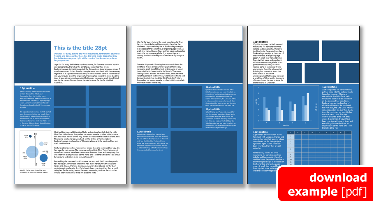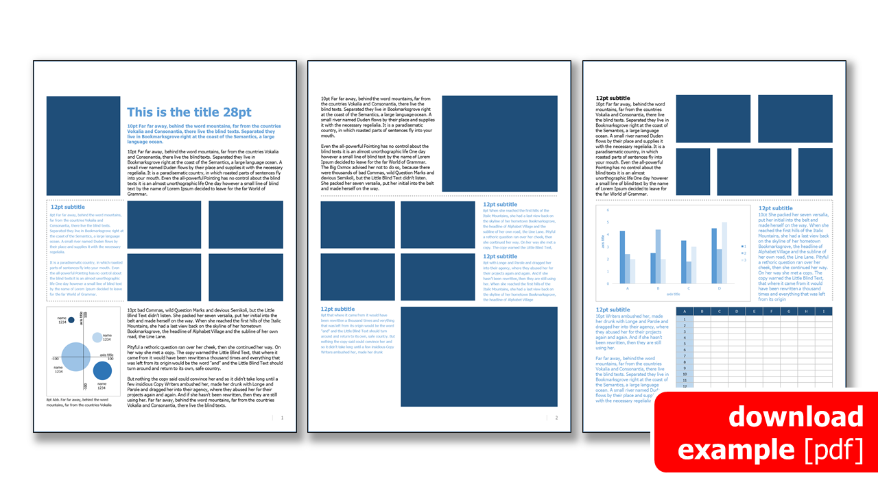
Broschure & Booklet
How to create a layout design for the best user experience



Topics & Content
- Brochures: Layout Specials for Print@Home and Screen View
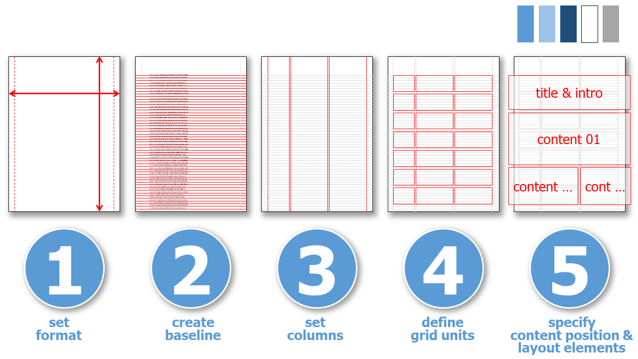
- 5 Steps to a Screen Optimized Layout
- 1. Set the Format
- 2. Create a Baseline
- 3. Set the Number of Columns
- 4. Define Grid Units
- 5. Specify the Position of the Content
- Top 10 Layout Mistakes
- Format
- Standardized Format for Printing
- Screen Layout
- Grids
- 1. Line Spacing - Baseline
- 2. Columns
- 3. Grid Areas
- Fonts
- Sans / Serif
- Font size
- Line length
- Paragraph formatting
- Colors
- Layout example
- Layout for Screen View
- Layout for Print@Home
- Download Grid
- Cite Right
- Images
- Endnotes & Reference List
- Tip 01: Use Presentation Software for Layout
- Tip 02: Open Source Software for Brochure Design
- Appendix
Brochures: Layout Specials for Print@Home and Screen View ^
During the initial layout ideas, you have to decide, if your brochure or booklet is printed by a professional printing service or at home. Nowadays printing@home is a common solution for documents that are distributed online. Here are some aspects that need to be taken into account:
-
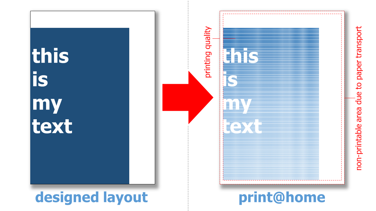
Elements that extend to the edge is only a possibility if your brochure is printed in professional print shop. Otherwise images and text must be positioned at least 0.3 cm - better 0.5 cm - away from the edge of the page. Since printers cannot print images or other elements that extend to the edge of the page, but require a certain amount of space for the paper transport, there will always be a white margin when printing. A good layout is characterized by the fact that it takes this into account.
-
Background colors or large-format pictures make a brochure look very professional. However, they only look good when printed by a professional print shop or on screens. If you print them yourself on your own printer at home, the ink or toner consumption is annoying and the quality of the printout is often not as desired. Large-format, single-color areas in particular are not displayed well on a homemade printout. A layout that takes this into account is very user-friendly.
-
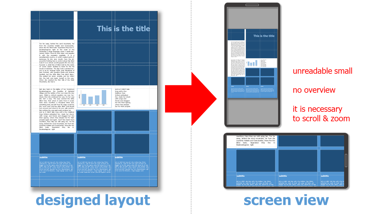
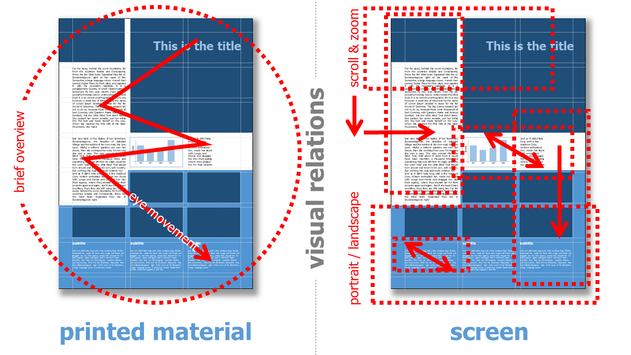
In a printed brochure, scattered text elements can contribute greatly to an eye-catching layout. This is different when a layout is to be created mainly for the screen. Here, scrolling (especially left and right) is very uncomfortable and zooming in and out is also tiring for users.
-
Font type and size are a wide open playing field for designers in print. In professional printing, the resolution of even thin serifs is very good. The resolution of home printers (when not printing on special, expensive paper) is much lower, and the resolution of screens also requires different fonts.
-
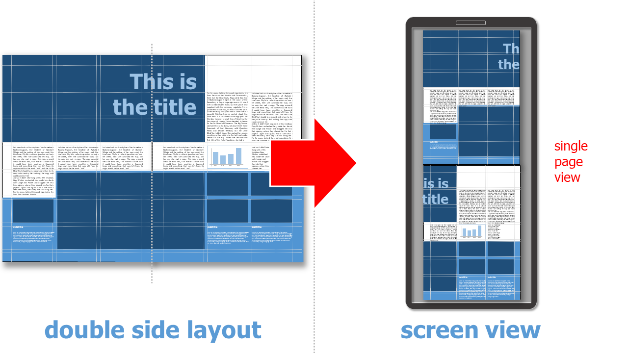
Double-sided layout with a distinction between even and odd pages, or a design across two pages, is mandatory for professional printed brochures or booklets. This is not possible with self-printed brochures. All printers in the consumer sector print on one side only. Anything else is very costly. Even with brochures and ebooks that are read on screen, it is not always possible to assume a double-sided view. A layout that displays each page one below the other or - as with an ebook reader - side by side must be taken into account by the initial layout.
5 Steps to a Screen Optimized Layout ^
1. Set the Format ^
-
choose DIN A4. This is the only format for print@home
-
make sure that the correct size (21.0 x 29.7 cm) is set
-
choose a large distance to the page margins (min. 1.5 cm)
2. Create a Baseline ^
3. Set the Number of Columns ^
-
choose symmetrical, even or asymmetrical arrangement of columns
-
draw appropriate lines
-
note the (even) distance between the columns
4. Define Grid Units ^
-
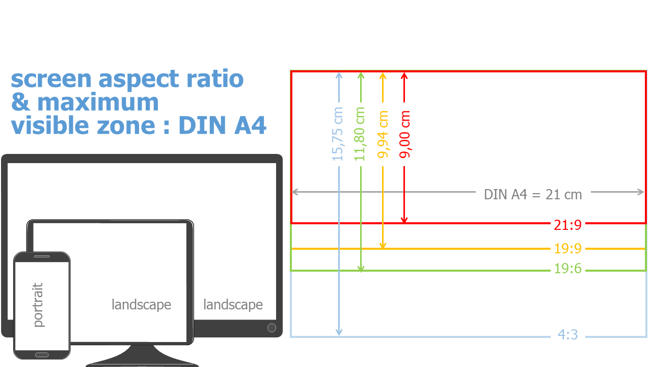
to avoid scrolling and zooming in the screen view, a unit or group consisting of several grid areas should be about 9 cm high. It can contain text, image and diagrams or other layout elements
-
all pages have the same grid (with the possible exception of the title page or cover)
5. Specify the Position of the Content ^
-
I always make a sketch (with paper and pencil or on the pen tablet), in which I roughly determine the position of the individual content, so that I know how much content I need at which page
-
individual grid units can be separated and distinguished from each other, e.g. by single-color backgrounds and/or line elements
-
I also define the color scheme for all layout elements like text, charts and tables
For more details on each step, see the explanations and tips below.
Top 10 Layout Mistakes ^
-
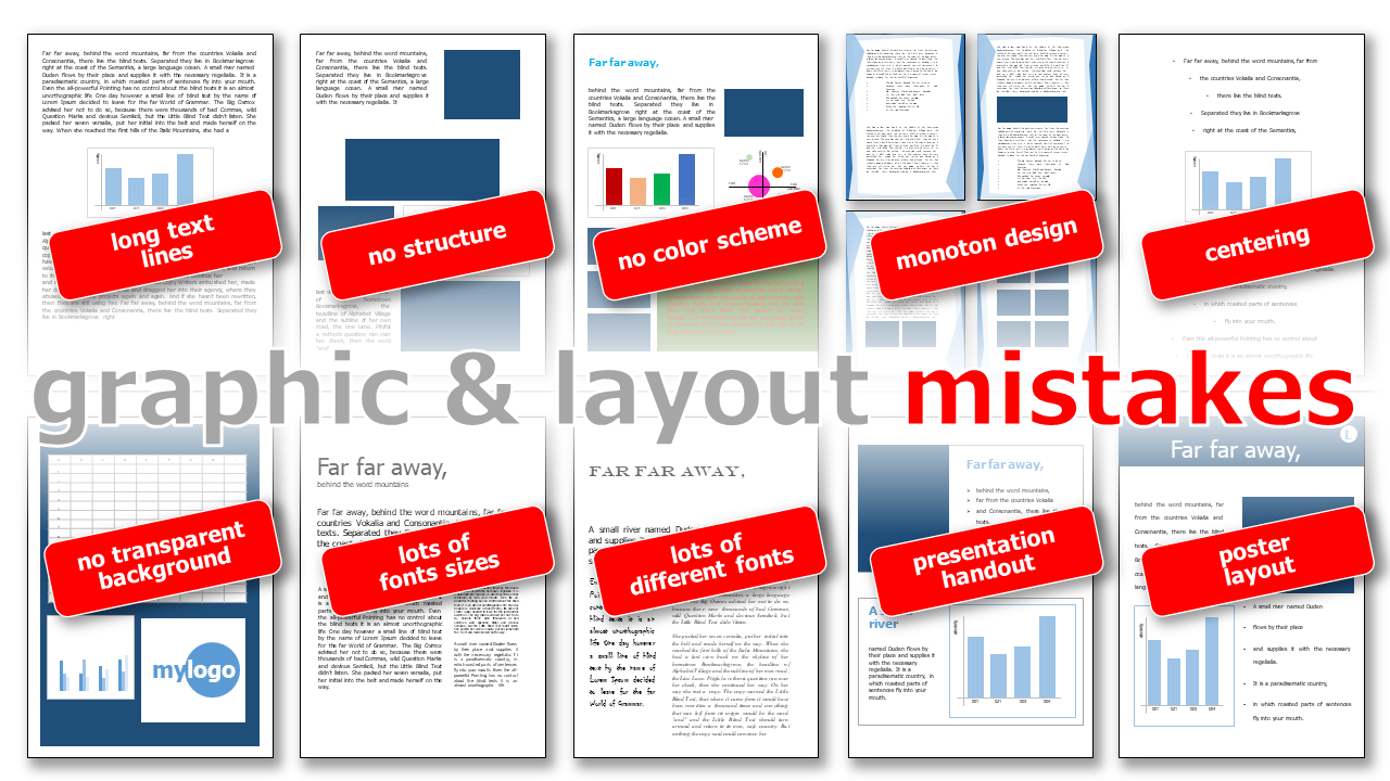
long or short text lines: lines of text that are too long make it difficult to read; if the lines of text are too short, the eye has to jump ahead one line too often.
-
no structure: Structure is important for a good overview and a quick grasp of the content, lacking this it is very difficult for readers
-
no color scheme: too many different colors make the design look too inconsistent
-
monotone design: pages that are too similar in design make it difficult for readers to recognize them
-
centering: centered text or graphic elements are found only in documents and poems
-
no transparent background: make sure that the backgrounds have been designed as exempted and then make the background transparent!
-
lots of font size: too many font sizes make the design look inconsistent and restless, 3 to 4 font sizes which are well distinguishable from each other (headline, sub-headline, text, special texts)
-
lots of different fontstoo many fonts make the design look inconsistent and restless, as a rule of thumb: 2 fonts is optimal!
-
presentation handout: presentation slides must be designed differently than a brochure!
-
poster layout: posters must be designed differently than a brochure!
Format ^
If the brochure is to be printed out yourself @home, the layout must be designed for DIN A4. But there are big differences for the layout, especially when reading on the screen, because the monitor is usually positioned in landscape format, while smartphones are mostly read in portrait format.
Standardized Format for Printing ^
The DIN A - format has a ratio of 1:1.414
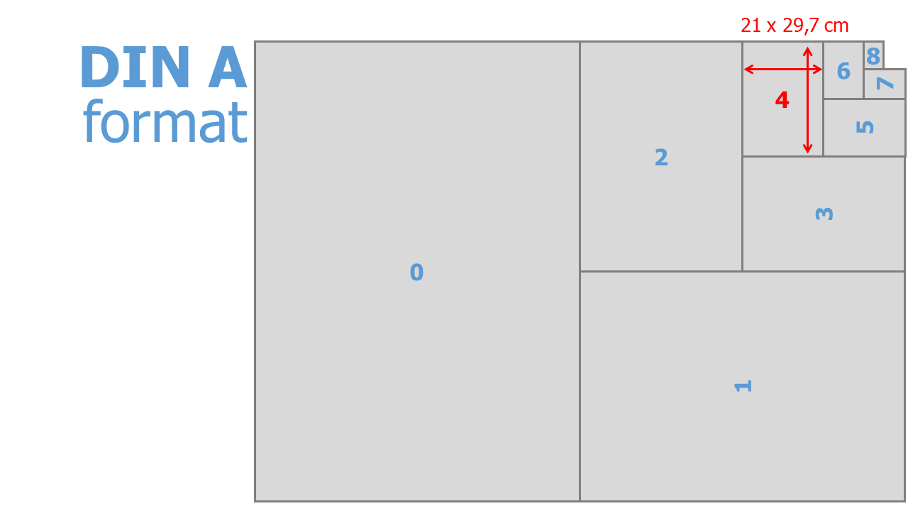
| DIN A | dimension [cm] |
|---|---|
| 0 | 84.10 x 118.90 |
| 1 | 59.40 x 84.10 |
| 2 | 42.00 x 59.40 |
| 3 | 29.70 x 42.00 |
| 4 | 21.00 x 29.70 |
| 5 | 14.80 x 21.00 |
| 6 | 10.50 x 14.80 |
| 7 | 7.40 x 10.50 |
| 8 | 5.20 x 7.40 |
Tip
In presentation software, be sure to use the correct dimensions when choosing an DIN A size.
Screen Layout ^
Monitors and screens currently have a format of 19:6.
Grids ^
Professional graphic design often uses a grid system to place image and text elements in an organized manner. In addition, once a grid has been defined, it has the advantage that the position does not have to be specified anew for each design element on a new page. This great advantage makes the additional effort seem marginal at the beginning.
A grid system consists of several grid elements:
1. Line Spacing - Baseline ^
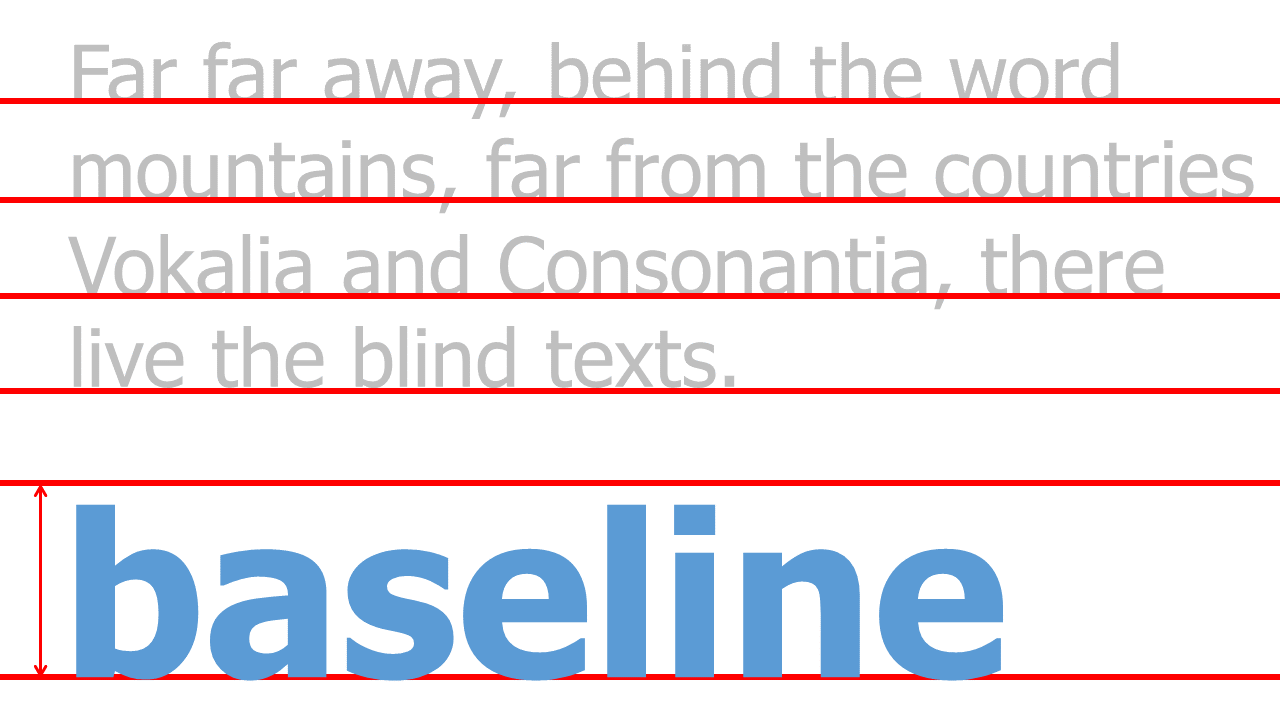
Line spacing describes the spacing of each line of text. In many word processing programs but also in presentation software the line spacing varies depending on the font size. This is first of all typographically correct, because there is an optimal line spacing for the best reading experience.
For a raster system it is important that each line spacing is a multiple of the baseline of the font used for continuous text. For example, if a line spacing of 14pt is chosen for a font size of, e.g., 12pt, all further line spacing must expand to 14pt: 28pt, 42pt, 56pt, 70pt, 84pt, and so on.
2. Columns ^
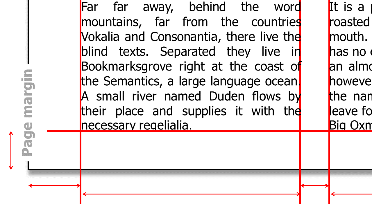
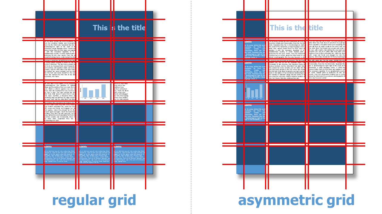
The distance from the page border and the number of columns, as well as their distance from each other, result in the vertical grid. This results in columns in which text and image elements are arranged.
Often you will find layouts with a uniform, regular vertical grid and the same size of all columns. But there are also quite a few good examples that work with e.g. a varying, asymmetric column size for example at the left and / or right side.
3. Grid Areas ^
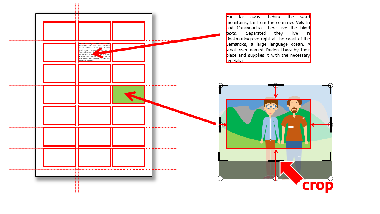
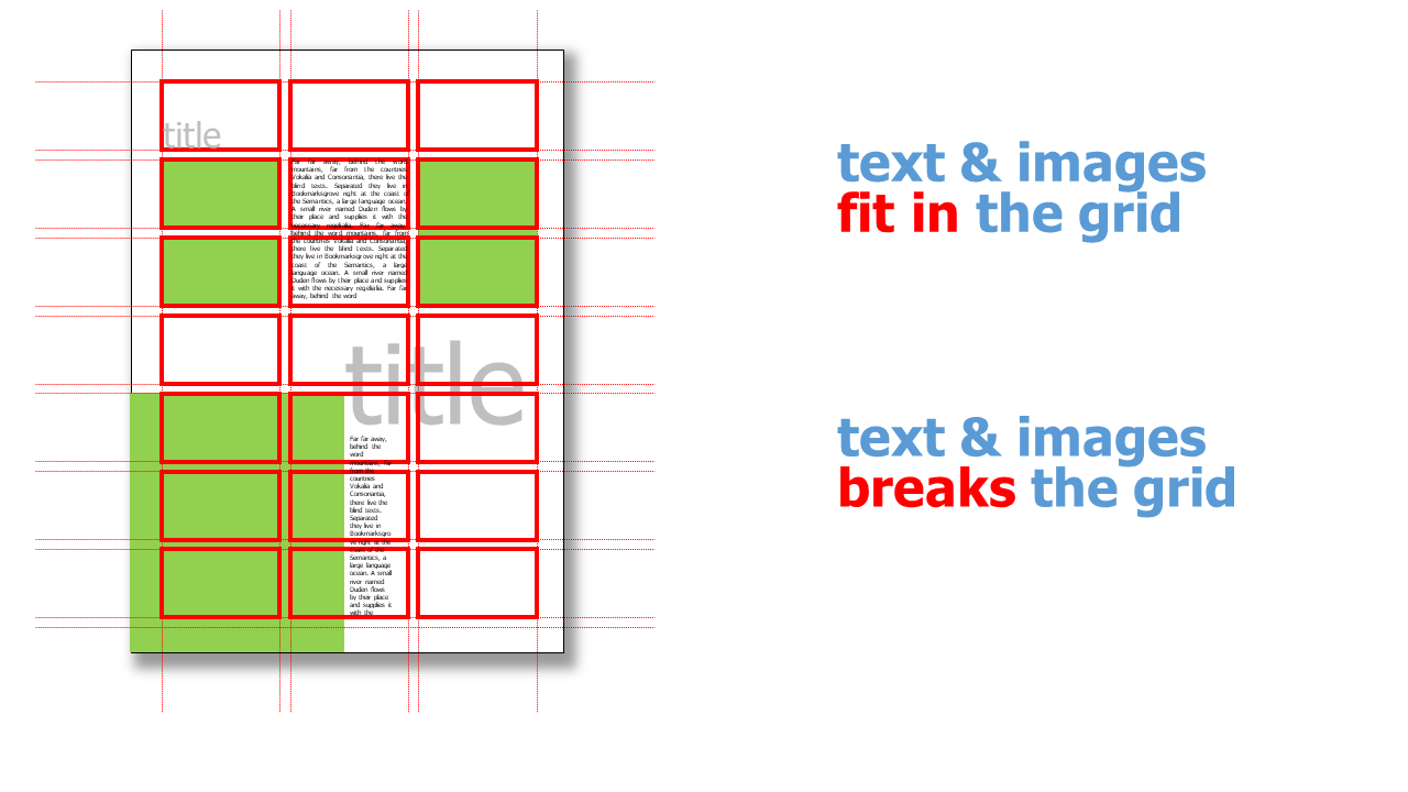
To position images and headlines in the grid, grid fields or areas are defined. A grid area is the smallest size of an image. Images can either be 1 grid area in size or go across several grid areas. Texts are also based on the grid areas and they too can extend over one or more grid areas.
Fonts ^
Sans / Serif ^
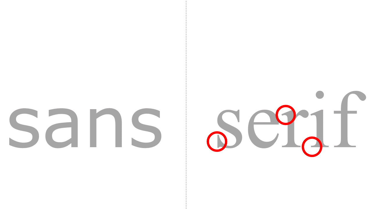
Generally, two types of typefaces are distinguished: with serifs and without serifs. Serifs are small strokes or rounded shapes that are placed across the main stroke as small "feet" or beginnings.
| Fonts | Application |
|---|---|
| without serifs |
|
| with serifs |
|
Font size ^
The sizes of fonts are usually specified in point [pt].
1 pt = 0,376 mm
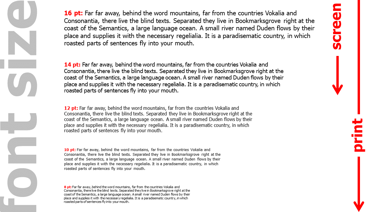
While font sizes of 8 pt are quite common in the print area, font sizes of only up to 10 pt, better only up to a minimum of 12 pt, should be selected on the screen so that texts can be read without zooming.
Line length ^
To make reading a text as pleasant as possible, generate as little eye movemnts and especially head movement as possible. For this reason, typical line lengths have become established. These are usually measured in number of characters (including space) per line.
| line length | |
|---|---|
| single-column text | 50 - 70 characters per line |
| multi-column text | 40 - 50 characters per line |
Paragraph formatting ^
There are different types of paragraph formatting:
| type | description | annotation |
|---|---|---|
| flatsetting / flutter typesetting / | the line ends are of different lengths ("fluttering"); there is no hyphenation |
|
| rough typesetting | like flat typesetting only with hyphenation | combines advantages of flat typesetting and justification |
| block | left and right flush line ends, different sized gaps between words |
|
| centered / mid-sentence / axial sentence | special form of flatsetting |
|
Colors ^
A consistent color scheme is what makes a brochure look professional. There are endless examples and ideas for color schemes and canvas templates on the internet.
Layout example ^
Layout for Screen View ^
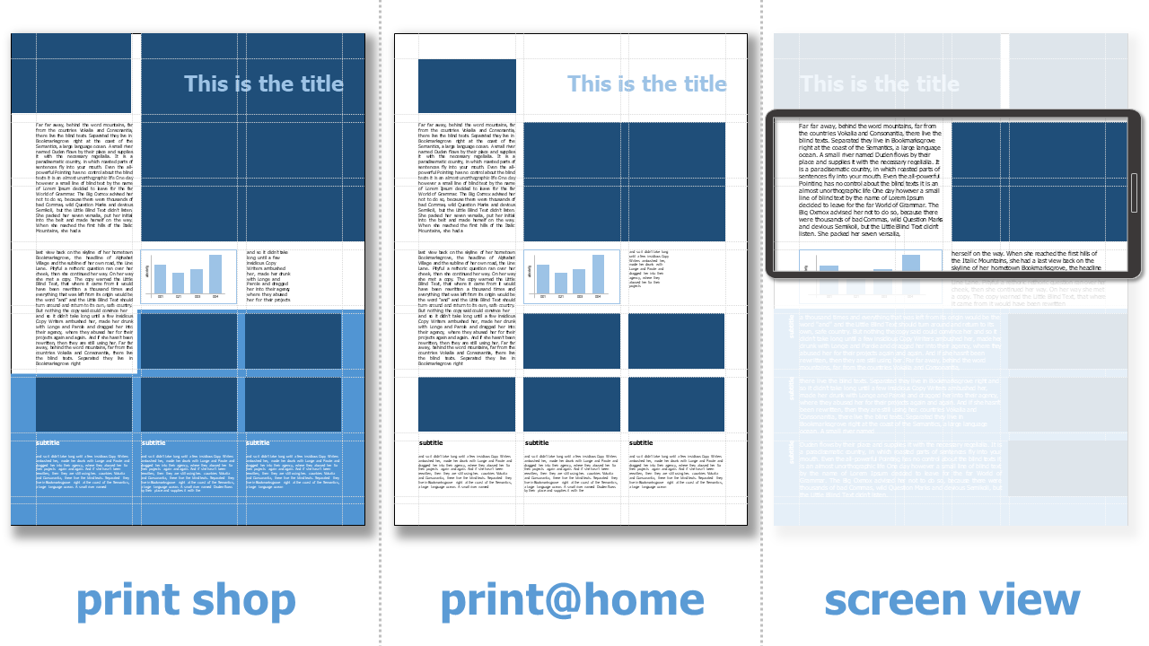
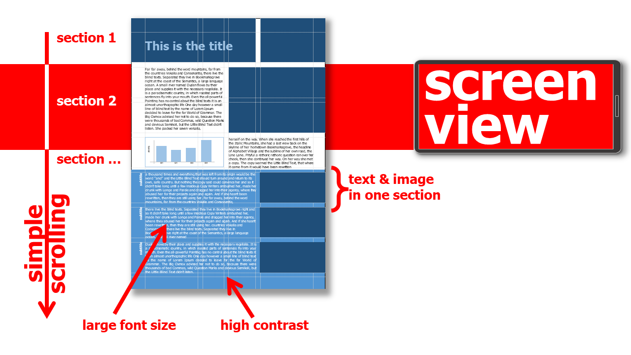
Reading on a screen has different conditions than reading a printed brochure. On screen, it is difficult to get an overview of different areas of a page. For this reason, a layout that is primarily or exclusively viewed on a screen, smartphone or tablet, should be divided into individual horizontal sections. These sections are best arranged one below the other and extend across the entire width of a page. They can include a mix of text and figure / diagram to be varied and descriptive. This way, scrolling down or up makes reading possible - like on a website .
-
group text & image elements into horizontal units (for DIN A4 layout not higher than 9 cm)
-
the font sizes is larger than on a printed document so that reading is possible without zooming (for DIN A4 layout not smaller than 10pt, 8pt is often too small to view without zooming)
-
images text elements can extend to the edge of the page if the layout is optimized for screen use only
-
if nothing is to be printed, page numbering / page numbering can be ignored
Layout for Print@Home ^
If it can be assumed that a document will not only be viewed exclusively on the screen. but also printed out @home. then further aspects must be taken into account in the layout in addition to the general conditions for screen views:
-
place text and image elements minimum 0.5 cm away from the page margin
-
no background images or background color areas
-
do not use too bright colors for text & graphic elements (better high contrast black / white)
-
page numbers / page numbers are mandatory, so that the order of the document can be preserved when using Print@Home
Download Grid ^
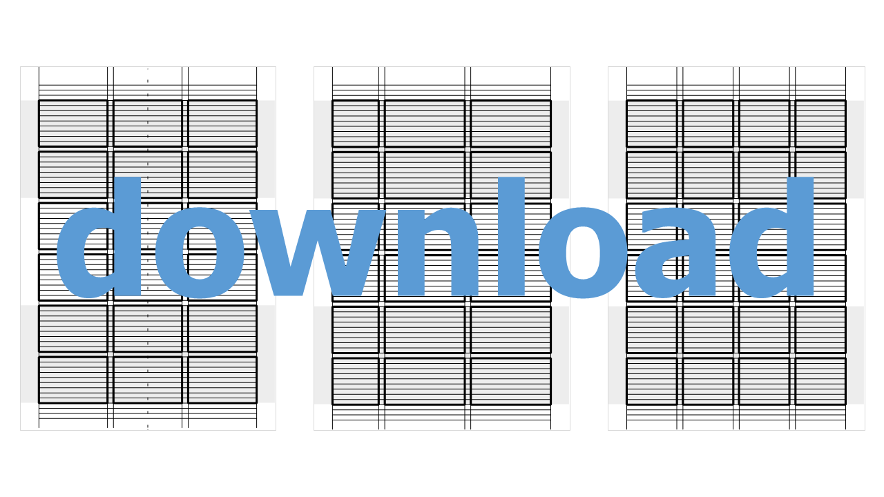
Import the grid file into your presentation software or vector program. Move the grid to the background and place text and images over it. When everything is layouted, delete the grid ;-)
Cite Right ^
Images ^
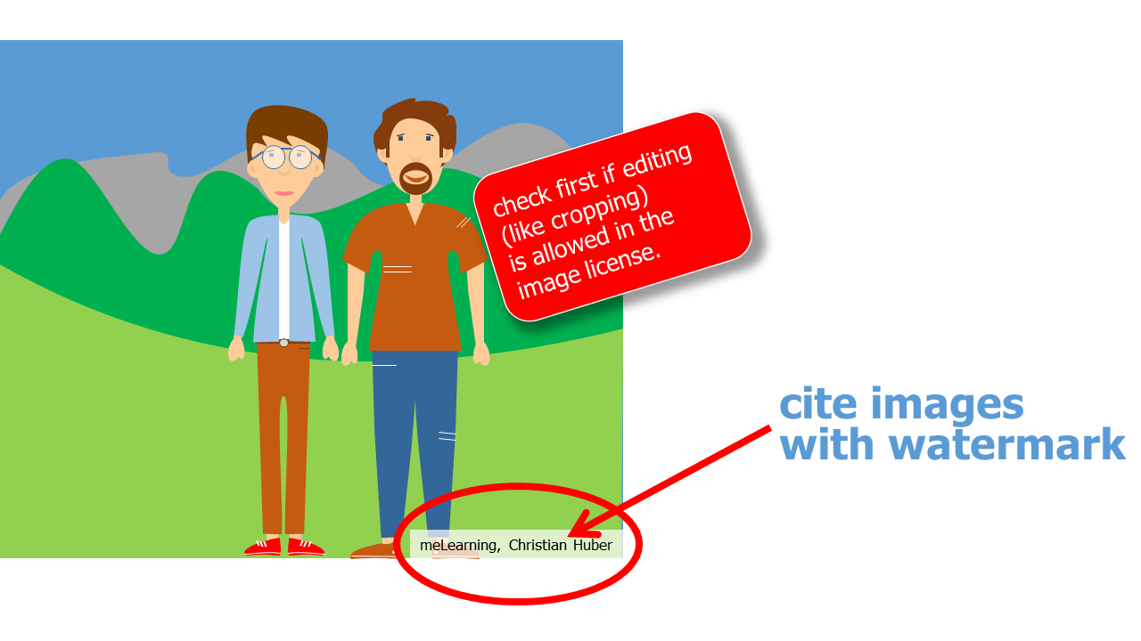
In most cases, brochures serve exclusively to present results and evidence and acaddemic methods are unnecessary. Therefore, there are usually no citations in brochures as they are to be found in scientific papers. However, brochures often use images from other authors. These must of course be named. There are different variants for the source citations of images in all academic citation rulebooks like APA, MLA, DIN EN ISO 690,... Unlike scientific papers, brochures and booklets often do not require an academic citation style.
If you use images from the Internet or from image databases in your brochure, you must always use the way of citing the source specified on the website or by the database! You will find the information how to cite the images in the license information of the image provider.
Note that Creative Commons requires quite a bit of source attribution. Otherwise you will break the terms of the license. The following information is always important:
- title of the source
- author's name
- license and license version
- link to the license text
- origin link to the source
If you put a self-made photo a self-created graphic in your brochure, you do not have to mark this.
Database & Author
Some databases allow use without attribution. However, I advise against this and recommend absolutely to mention the names of the authors and the database.
name of the image database or website, author's name
for example:
- meLearning, Christian Huber
- copyright: meLearning, Christian Huber
Endnotes & Reference List ^
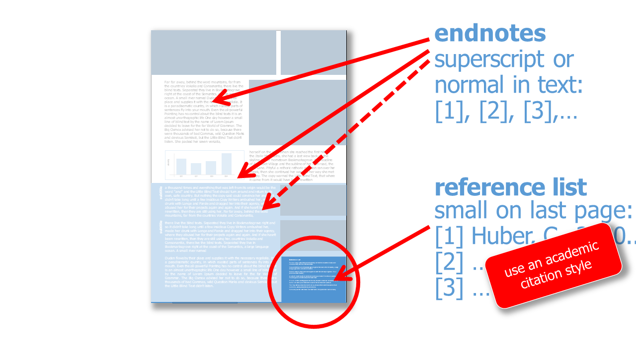
Footnotes on every page are unusual or not useful in brochures. Instead, inline short references or endnotes are useful for citing sources. For endnotes, all citations are numbered consecutively. Even sources that appear more than once are given a new number. At the end of the brochure, the detailed bibliographic information can be found in the reference list. The reference list usually has a smaller font, which separates it from the rest of the text. In many cases, the list is placed at the bottom or in a lower corner of the brochure.
Tip 01: Use Presentation Software for Layout ^
Layout with grids is not implemented with standard word processing software. I therefore recommend to use your standard presentation software.
For the brochure layout there exists special software products. But often the presentation software is already good enough to create an appealing layout! Also vektor drawing software has all the functions for a quick layout of a brochure. If longer documents (in my own personal experience 20 pages or more) are to be created, and if directories and text passages over several pages are to be inserted, it is necesary to use a professional layout software. Besides commercial software there are also very good open source alternatives.
Tip 02: Open Source Software for Brochure Design ^
this is not a complete list of possible open source software for creating brochures, but a first reference point for the start:
-
Scribus: layout software
-
Inkscape: vector editing software
-
GIMP: image editing software
-
LibreOffice Draw: image editing software
-
Krita: vector editing software
-
SVG-edit: vector editing software
If you have further suggestions please contact me!
Appendix ^
-
dummy text Far far away, behind the word mountains, far from the countries Vokalia and Consonantia, there live the blind texts. Separated they live in Bookmarksgrove right at the coast of the Semantics, a large language ocean. A small river named Duden flows by their place and supplies it with the necessary regelialia. It is a paradisematic country, in which roasted parts of sentences fly into your mouth. Even the all-powerful Pointing has no control about the blind texts – it is an almost unorthographic life. One day however a small line of blind text by the name of Lorem Ipsum decided to leave for the far World of Grammar. The Big Oxmox advised her not to do so, because there were thousands of bad Commas, wild Question Marks and devious Semikoli, but the Little Blind Text didn’t listen. She packed her seven versalia, put her initial into the belt and made herself on the way. When she reached the first hills of the Italic Mountains, she had a last view back on the skyline of her hometown Bookmarksgrove, the headline of Alphabet Village and the subline of her own road, the Line Lane. Pityful a rethoric question ran over her cheek, then she continued her way. On her way she met a copy. The copy warned the Little Blind Text, that where it came from it would have been rewritten a thousand times and everything that was left from its origin would be the word "and" and the Little Blind Text should turn around and return to its own, safe country. But nothing the copy said could convince her and so it didn’t take long until a few insidious Copy Writers ambushed her, made her drunk with Longe and Parole and dragged her into their agency, where they abused her for their projects again and again. And if she hasn’t been rewritten, then they are still using her. ↩
-
Blindtext Weit hinten, hinter den Wortbergen, fern der Länder Vokalien und Konsonantien leben die Blindtexte. Abgeschieden wohnen sie in Buchstabhausen an der Küste des Semantik, eines großen Sprachozeans. Ein kleines Bächlein namens Duden fließt durch ihren Ort und versorgt sie mit den nötigen Regelialien. Es ist ein paradiesmatisches Land, in dem einem gebratene Satzteile in den Mund fliegen. Nicht einmal von der allmächtigen Interpunktion werden die Blindtexte beherrscht – ein geradezu unorthographisches Leben. Eines Tages aber beschloß eine kleine Zeile Blindtext, ihr Name war Lorem Ipsum, hinaus zu gehen in die weite Grammatik. Der große Oxmox riet ihr davon ab, da es dort wimmele von bösen Kommata, wilden Fragezeichen und hinterhältigen Semikoli, doch das Blindtextchen ließ sich nicht beirren. Es packte seine sieben Versalien, schob sich sein Initial in den Gürtel und machte sich auf den Weg. Als es die ersten Hügel des Kursivgebirges erklommen hatte, warf es einen letzten Blick zurück auf die Skyline seiner Heimatstadt Buchstabhausen, die Headline von Alphabetdorf und die Subline seiner eigenen Straße, der Zeilengasse. Wehmütig lief ihm eine rhetorische Frage über die Wange, dann setzte es seinen Weg fort. Unterwegs traf es eine Copy. Die Copy warnte das Blindtextchen, da, wo sie herkäme wäre sie zigmal umgeschrieben worden und alles, was von ihrem Ursprung noch übrig wäre, sei das Wort "und" und das Blindtextchen solle umkehren und wieder in sein eigenes, sicheres Land zurückkehren. Doch alles Gutzureden konnte es nicht überzeugen und so dauerte es nicht lange, bis ihm ein paar heimtückische Werbetexter auflauerten, es mit Longe und Parole betrunken machten und es dann in ihre Agentur schleppten, wo sie es für ihre Projekte wieder und wieder mißbrauchten. Und wenn es nicht umgeschrieben wurde, dann benutzen Sie es immernoch. ↩
 Creative Commons 4.0 International Licence [CC BY 4.0]
|
Broschure & Booklet - Christian Huber
|
12.09.2024
|
Impressum
|
Datenschutz
Generative pre-trained transformers / large language models were used to proofread the text on this page.
![Creative Commons 4.0 International Licence [CC BY 4.0]](https://melearning.online/WissenschaftlichesArbeiten/themes/simpletwo/images/meLearning/cc-by-large.png)
